Hisense 01.jpg
Hisense 02.jpg
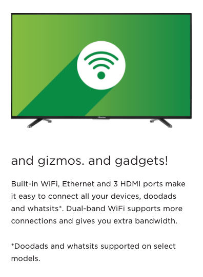
Hisense 03.jpg

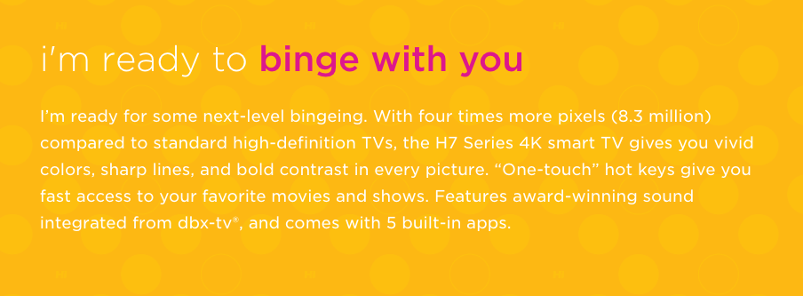
Hisense 04.jpg
Hisense 05.jpg
Hisense 06.jpg

Hisense 07.jpg
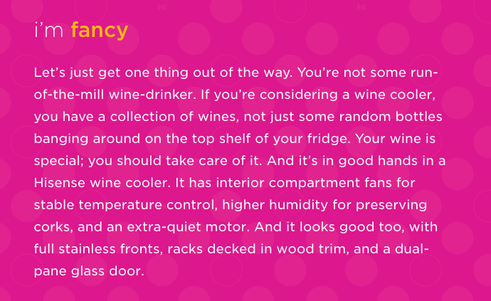
Hisense Description.rtf
Hisense USA
branding/website
Man, I love this work.
Maybe it’s because the team and I built the brand from the ground up. Usually with projects like this, vestiges of the former identity remain. But the Hisense brand was so new in the US, we felt good about a complete overhaul. The only things we kept from the existing brand were the logo and one color.
And maybe it’s because after years of being talked down to by technology companies I really like a brand that speaks to people like a friend. You won’t read show-offy names for product features or speeds-and-feeds drivel. Their voice sounds how people really talk. How refreshing.
But mostly it’s because it’s daring. We fought hard for a tone that was witty and youthful. The site is a riot of neon colors and smiling faces. It’s funny and light, and peppered with humor in places where one is used to finding straight-up utility. (Our designer, Corey Price, used “words for nerds” for temporary placeholder copy over the tech specs. He did it to make me laugh, but I called his bluff and kept it. Look at a product detail page if you don’t believe me.)
Agency: Olson
Credits:
Senior Writer: Hillary Churchill
Brand designer: Ryan Bren
Website Designer: Corey Price
3D Illustration: Dennis Sengthong
Associate Design Director: Joe LaPorte
Design Director: Joe Monnens
UX Designer: Buck Winfield
Head Developer: Charlie Pugmire
CCO: Kevin McKeon
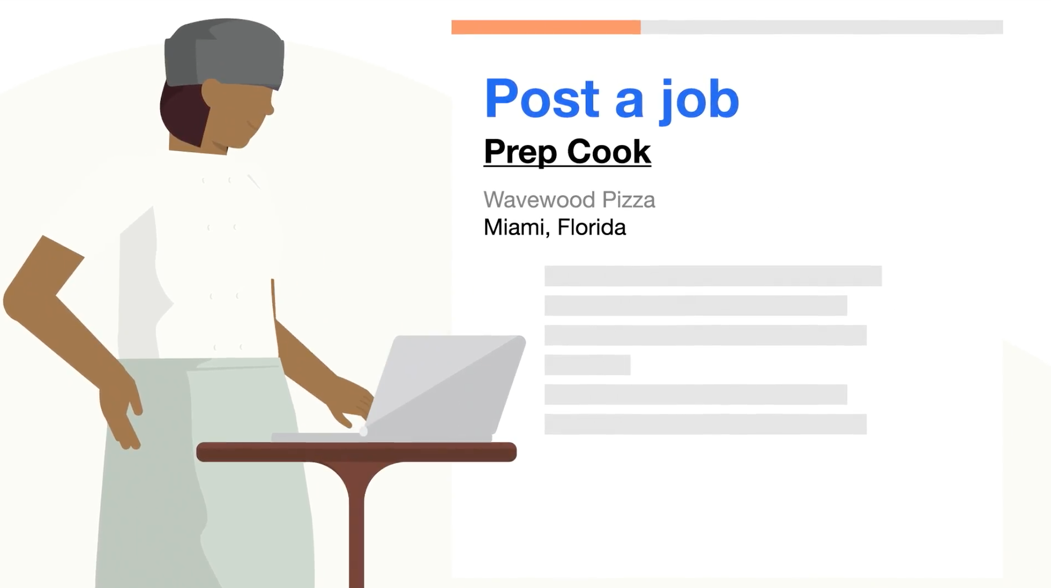 Indeed
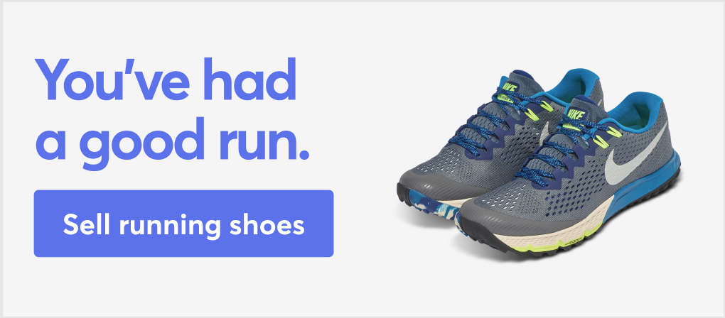 Mercari
 Trulia
 Hisense
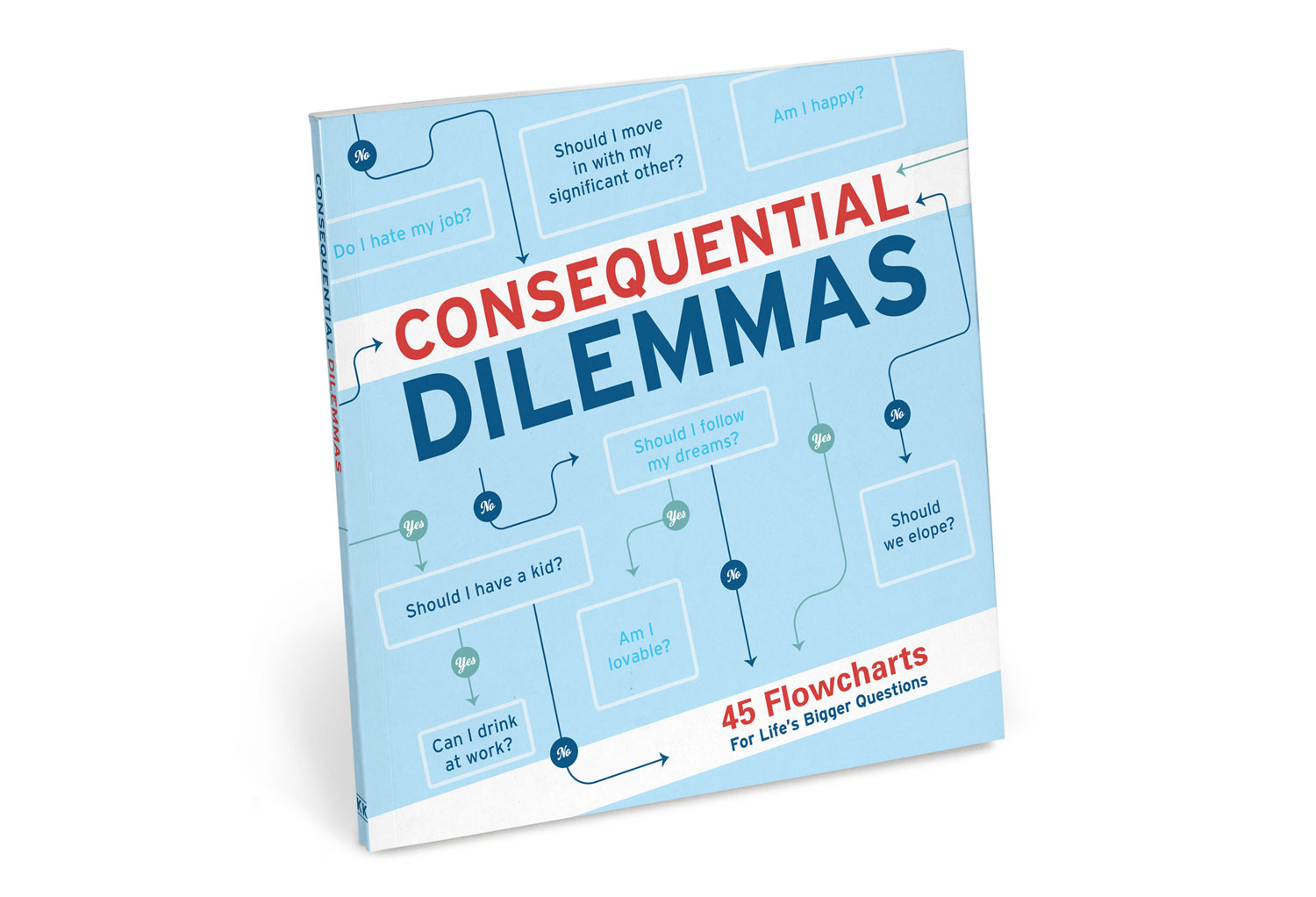 Consequential Dilemmas
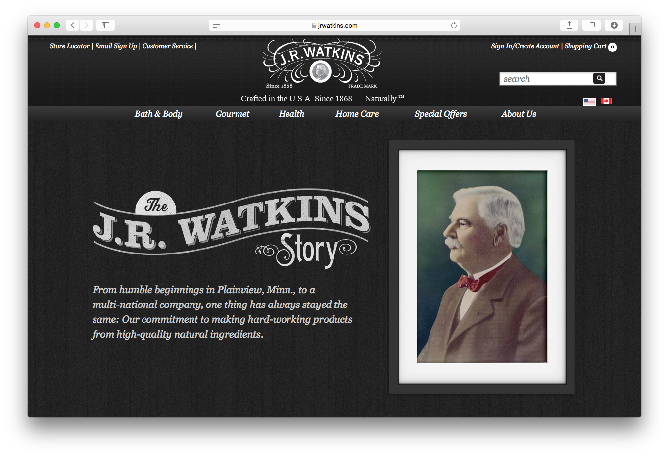 J.R. Watkins
 Northwestern Mutual
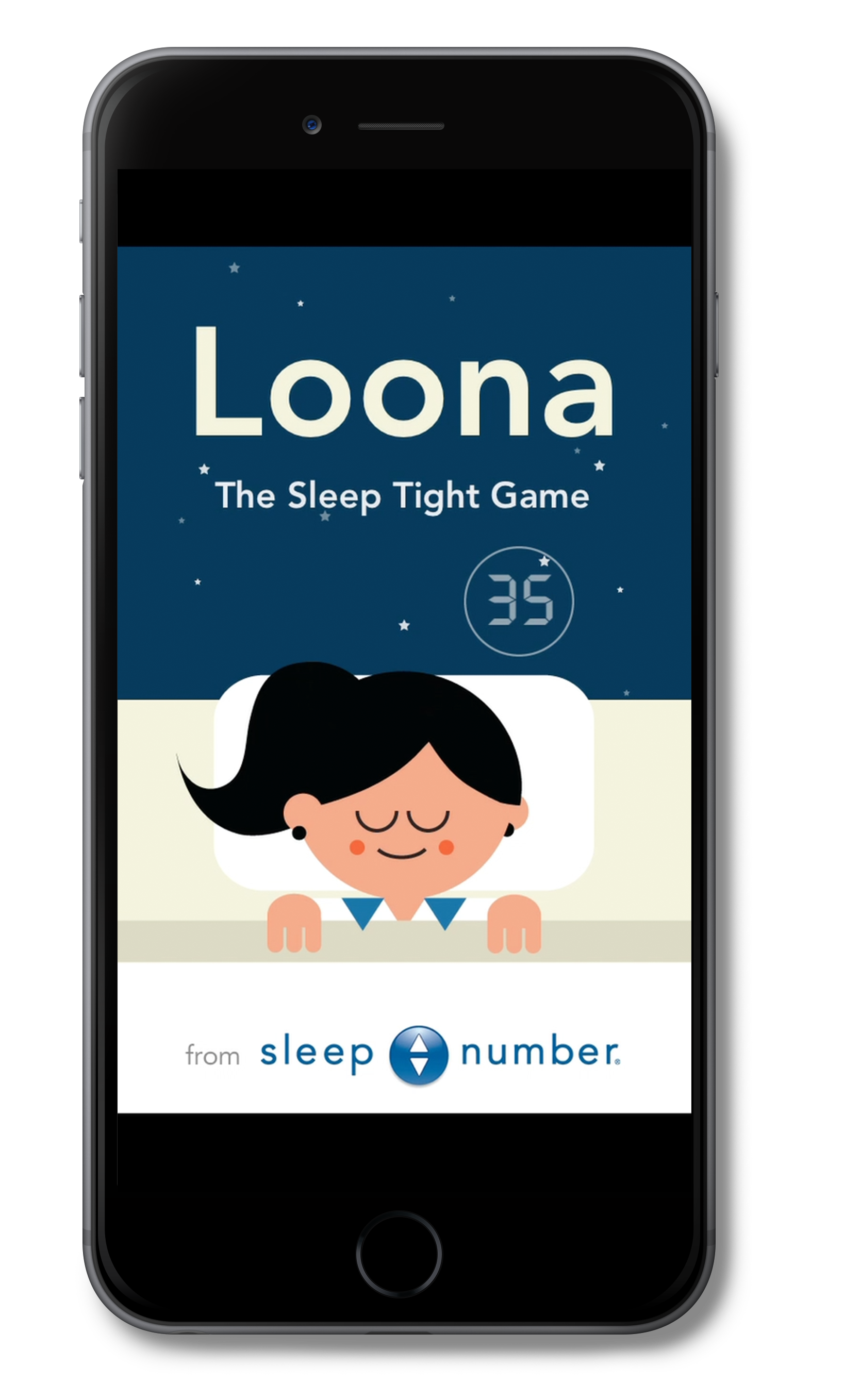 Sleepnumber
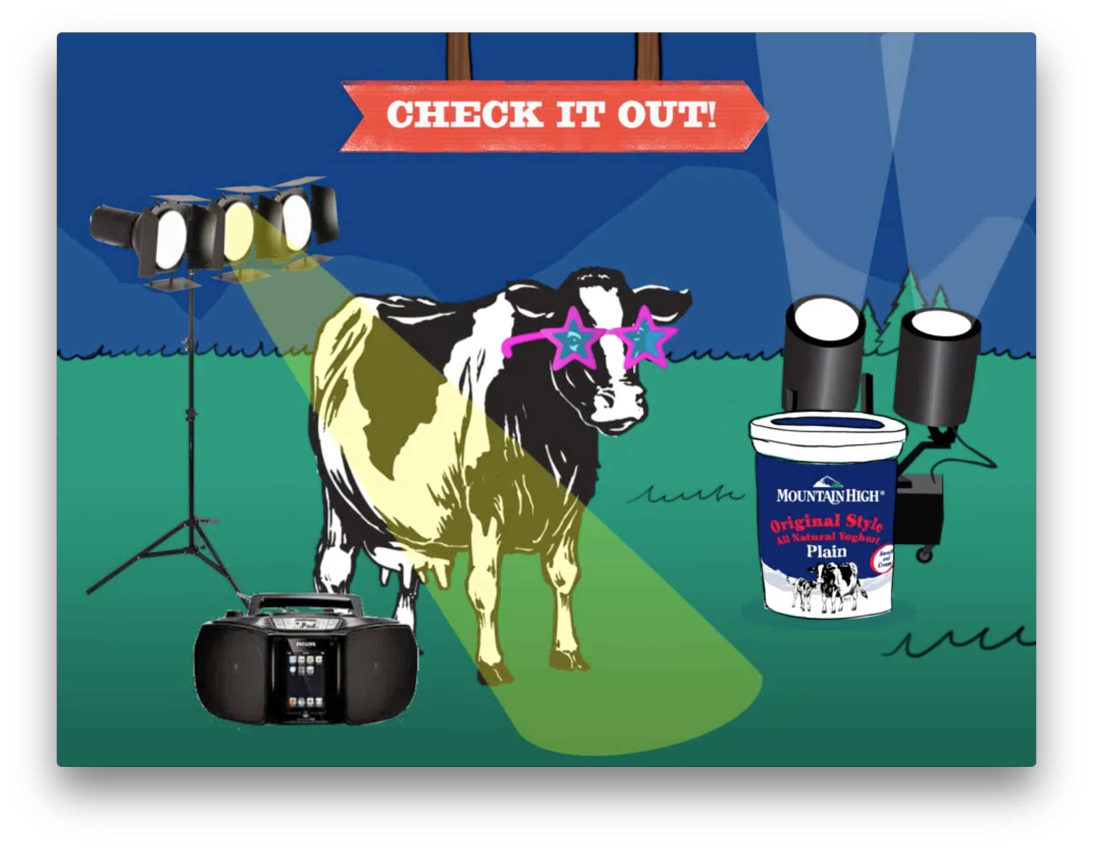 Mountain High Yoghurt
about.rtf